Stock Market Viewpoint

Stock Market Viewpoint
Reading the Tea Leaves...

Friday, September 28, 2012

APPL - SPY - Nasdaq - Triangles

Stock Market Technical Analysis Blog

Click on image to enlarge


Premarket this morning we got the September's Chicago PMI reading, a universal benchmark of the National economy and it came in at 49.7 which is the first reading below 50 since the dark days of 2009.  Add to that yesterday's first quarter GDP revision from 1.7 to 1.3 and also trouble in the transports with the global economic activity barometer - FedEx - revealing a gloomy outlook last week and the same outlook from Caterpillar another global economic activity barometer.  Plus the price of oil diving on the fears that a weaker economy will have a reduced demand for oil and all this together looks like we are starting to get the components for a perfect storm.

Two weeks ago when Bernanke released QE3 onto the market the initial reactions were just what he spoke which was to take the stock market higher.  As the days went by a lot of people started to wonder why Bernanke took such extreme measures.  Now it has become clear that he knew what was just around the corner, some economic readings that spell trouble for the economy.

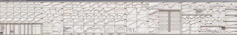
Yesterday's market indexes 5/20 bounce shown last night and in the charts above failed to have any follow through today and sold down so much today that we are now once again at risk for a red/blue 5/20 down cross in AAPL, SPY, and the Nasdaq as shown in the lefts side charts above.  Also shown above is the VXX where today's market sell back twisted last night's downward curved 5 EMA line back up to level with the green 10 putting the dreaded VXX 5/10 up cross back as a strong possibility.

Another notable item tonight shown on the right side charts above are the triangles visible in the 120 minute bars charts of the Nasdaq, SPY,  and AAPL signaling a fast and strong move will happen soon in the broad market.

One more notable item is GOOG, a stock that has been the default receptor of market money the past two weeks as AAPL fell into its funk.  In the past three night's we have seen ugly day candles as GOOG hit its upper channel line and at the closing today it had the classic "twin" institutional exit trade - two twin 144.45k block sells at 754.50.  One major Wall Street firm has exited GOOG.

Since Bernanke has put his credibility on the line by actually voicing his intention to push the stock market higher you have to believe he will follow through one way or the other.  Yet it cannot be ignored that the economy is walking on thin ice and it's pretty obvious Bernanke sees something coming that the rest of us can't.

Alan
The AAPL cluster and big picture clusters are updated below:

Click on image to enlarge


Click on image to enlarge

Click on image to enlarge

Thursday, September 27, 2012

Relief Rally from Day 5/20 EMA Bounce

Stock Market Technical Analysis Blog

Click on above image to enlarge

Following up from my closing paragraph from last night's blog where I mentioned that Wall Street would have the opportunity to easily bounce the market this morning because of the 5/20 EMA line bounce setup appearing on AAPL and the major indexes last night.  We did indeed have a relief rally and it was huge.  The red/blue 5/20 bounce set up I mentioned last night is shown above in today's daily bars charts of AAPL, SPY, and Nasdaq on the left side above.  As usual nearly every stock market news site out there had a different cut and paste reason for this rally.  

This technical relief rally was timed perfectly as can be seen by the right side chart VXX (VIX futures) where we had a red\green 5/10 EMA juncture last night and today's big rally started turning the red 5 back down, avoiding the dreaded VXX 5/10 up cross at least for today.  

Alan
the AAPL cluster and Big Picture Charts are updated below:


Click on above image to enlarge


Click on above image to enlarge

Click on above image to enlarge

Wednesday, September 26, 2012

VXX Lifts After Recent 3-Year Channel Breakout

Stock Market Technical Analysis Blog

Click on image to enlarge

In the charts tonight I would like to focus on the VXX but first I would like to say a few words on the ongoing SPY on balance volume divergence.  When you compare the charts on the left side above with last night's chart, we can see that the SPY dropped another dollar today but it happened  on net 200 million shares of selling.  Today's selling was actually three times heavier than yesterday's and tonight we not only still have the divergence but  it has increased to $8 from $6 last night.  If this relentless selling continues we should reach a short term oversold condition soon and the SPY and its on balance volume may get to be reconciled by the on balance volume lifting (net buying overall) instead of the SPY continuing to chase the OBV down.  This situation will be closely monitored by professional traders until we see what should be a rapid reconciliation taking place.

Now on to the VXX (S&P 500 VIX Short term Futures ETF) which can be viewed as a reading on fear looking forward whereas the VIX can be viewed as a reading on the current level of  fear in the market.  Its charts are posted on the right side above, the bottom chart being a five year chart of weekly bars and the upper chart being simply a focused view of the same chart using daily bars.

Looking at the lower chart we can see that the VXX has been in a huge downhill channel for three years but in the past month has broken up out of that channel and in the past two weeks it has started to push up from that channel line.  Anytime any trading vehicle breaks up out of a three year down channel, a substantial and extended move upward can be expected.  If this happens the potential damage to the stock market could be significant.   At the very minimum the VXX is a sentiment reading on stocks looking forward.  Breaking out of a three year downhill channel is a huge change in sentiment.

On to the AAPL cluster below, last night I mentioned we could expect Wall Street's support at that lower channel line or below it and today they did come in and stop the decline in the afternoon as shown the lower chart with the dotted blue line.  In the top left corner we see that the red 5 EMA sliced right through the green 10 EMA without an attempt to bounce there as also happened on the indexes.

Looking to tomorrow, with today's selling being somewhat overdone, it would be easy to bounce AAPL with a 5/20 red line/blue line bounce tomorrow as also is the case on the major indexes.  We could easily have a relief bounce tomorrow.

The big picture clusters are shown below the AAPL cluster.


Alan


Click on image to enlarge

Click on image to enlarge

Click on image to enlarge

Tuesday, September 25, 2012

SPY Divergence Holds as Nasdaq Loses Its Perch

Stock Market Technical Analysis Blog

Click on image to enlarge

Following up on last night's blog about the $6 SPY on balance volume divergence, we saw something exceptional today.  This afternoon a bout of heavy selling took the SPY down $2 but also took the on balance volume down 75 million shares of net selling ending up with still having a $6 divergence.  Normally with on balance volume divergences of this type, a day of heavy selling will pull the price considerably closer proportionately to its corresponding point on the OBV graph.  Today though, the net selling was so heavy that the OBV fell just as fast as the price which is why the $6 is still there.  On the left side chart above, the 120 minute bars chart of the SPY, I marked with a second pink dot where the SPY would be if it coincided proportionately with the decline from the red dot to the pink dot in the OBV graph.  There is some serious selling going on behind the relatively slow and controlled downtrend in the SPY the past week and a half.

Looking at the right charts above, I posted a 120 minute bars chart of the Nasdaq above a daily bars chart of the Nasdaq.  Looking at the daily bars chart where the QE3 pushed the Nasdaq onto a perch at the topside of its midterm channel, we see that the Nasdaq fell considerably back down into the channel this afternoon with selling accelerating into the final hour.

In the AAPL cluster below focusing on the 30 minute chart in the lower half, we see that the three day wide symmetric triangle broke to the downside today taking AAPL down to the lower line of its secondary channel shown with gray lines.  It would be reasonable to expect Wall Street support to come in if we slip through that line tomorrow as they did on 9/11 and 9/12.   Although with the speed of this descent there is no guarantee there.

One more notable item (I don't have charts of this shown tonight) is that over the past week and a half, every time the VIX spiked up the VIX Futures (VXX - tradeable ETF of the VIX Futures) hardly spiked up at all implying that traders felt no need to trade the VIX Futures up as they felt the VIX would be coming back down shortly with the Fed on the field.  Today though the VXX spiked up just as much as the VIX itself signaling a change in sentiment about this QE3 rally.

Even though they could easily gap the market up in the morning on whatever convenient reason to see if they can trigger a daily 5/10 EMA bounce on the indexes and AAPL, it still might not be a bad idea to tighten your seat belts here.

Updated big picture charts are shown below the AAPL cluster.

Alan


Click on image to enlarge

Click on image to enlarge

Click on image to enlarge


Monday, September 24, 2012

$6 SPY On Balance Volume Divergence

Stock Market Technical Analysis Blog

Click on image to enlarge


Before I address the chart above, I will follow up on Friday night's blog where I focused on a divergence between the SPY and S&P 500 charts showing that the more rapidly falling SPY was threatening to pull the S&P 500 Index down with it.  This morning that scenario played out strongly with a gap down at the open.  

Addressing the chart above now, which is the two month chart of 120 bars of the SPY, I want to focus on another divergence that has been building.  On balance volume can be loosely interpreted as a measure of "real buying" and if the market is not being manipulated the relationship between the on balance volume's peaks and valleys should at least roughly correspond with the peaks and valleys with the price bars above it which was the case the first five weeks on the above chart of the SPY.

On September 7th the price and the OBV graph both are visually low in their respective sections of the chart.  From September 7th through 15th we see a massive run up in the SPY and a massive run up in the OBV.  Once they both peaked, about September 14th is where the market manipulation began.  Over the past week and a half we have seen the 250 million shares of net buying that was registered from the 7th to the 14th get completely sold back down and actually to a lower level now than on the 7th.  Basically every net share bought has been sold as shown in the lower half of the chart which is the measure of the on balance volume but looking at the top half of the chart, the SPY price bars, we see that the price bars have only come about a third of the way back down because of the propping that has been going on the past week which I have mentioned in previous blog posts.  To see where the SPY should really be today, if it had traded true, it would now be slightly below $140 instead of $145.74 in the same fashion as the OBV is now slightly lower than it was on Sept 7th.

This divergence measures $6 on the SPY, a staggering amount rarely seen.  As with all  divergences one or the other will race to realign with the other.  They don't stay misaligned very long without an often sudden correction.

What has basically happened on the past week and a half is that market participants have been seeing the obvious propping going on and this has caused a lot of selling based upon a fear that this might be all the Fed can do with the QE3 push.

These two will likely reconcile soon with either a drop in the SPY or a huge amount of panic buying by participants to get back into the SPY if they see that the Fed breaks the SPY out of its week and a half slow downtrend.

The AAPL cluster and two big picture clusters are updated below.

Alan


Click on image to enlarge

Click on image to enlarge

Click on image to enlarge

Sunday, September 23, 2012

Sunday Night Quick Glance at the NASDAQ

Stock Market Technical Analysis Blog

Click on image to enlarge


The two charts above are of the Nasdaq, the lower is the year and a half daily bars chart and the upper is the four month chart of the 120 minute bars.  The upper showing the ascension channel since the summer rally began.  The lower shows the midterm channel where QE3 announcement popped the price up on top of its upper channel line.

Alan

Friday, September 21, 2012

Gap, Prop, and Drop

Stock Market Technical Analysis Blog

Click on image to enlarge

Continuing from last night's blog where I addressed the low quality setups constructed on AAPL yesterday and my doubts as to whether or not traders would buy into them were never subjected to the test of regular session trading as they decided to just gap it up at the open.  It was no doubt to make sure that AAPL was up on the first morning of iPhone5 sales.  Throughout the day AAPL and the market started getting heavy and sold down in the last two hours.  

Before we look at the AAPL cluster below, I want to address a divergence developing between the trendline charts of the S&P 500 and that of the SPY in the above charts.  The SPY is supposed to track and mimic the movements of the S&P 500 but most traders fully understand it works just the opposite, the SPY leads the S&P 500.  

In the charts above, the S&P at the top and the SPY below it, we see they have matching channels but the SPY actually slipped out of its channel whereas the S&P is not even close yet.  This is a classic divergence suggesting that traders are not so convinced in the prospects of this QE3 rally.  All divergences can go on for a day or two but when they correct there is typically a very sudden movement by one to realign itself with the other.  This is something the bulls will have to watch closely especially knowing that AAPL couldn't hold its gap up gains and also sold down in the late afternoon.  

Moving on to look at the AAPL cluster below, in the lower chart of that cluster the 30 minute bars chart, we see AAPL gapped back up into its channel but fell back out again in the late afternoon.  In that same chart I drew AAPL's secondary ascension channel with gray lines, a considerably more modest but still inclining channel which it is fighting hard to keep from returning to.  In the top left chart below, the daily bars EMA chart, we see that AAPL is still feeling lofty.  In the chart beside it, the daily candles, we see that today's candle is modestly bearish.  

The Fed is still struggling to start a big market squeeze to take the market convincingly higher but so far, it looks like all they can do is keep it sideways or prevent it from selling down much.  

The two big picture clusters are updated and shown below the AAPL cluster.

Alan


Click on image to enlarge


Click on image to enlarge

Click on image to enlarge

Thursday, September 20, 2012

AAPL

Stock Market Technical Analysis Blog

Click on image to enlarge


Continuing from last night's discussion of AAPL's rising wedge that was projecting an imminent drop, the wedge resolved itself this morning with a sudden drop in AAPL taking the entire market down with it.  The opening lows did not last long though as the market is still in QE3 prop mode.  Focusing in on AAPL tonight with the three charts above, starting in the top left corner daily bars chart we see that today's low actually pierced through the red 5 EMA line conclusively but they brought it back up through it to try to sell it as a price 5 EMA line bounce.  Not what really happened but they are looking for takers.  

In the top right corner chart, we see that AAPL printed a bullish reversal candle but without a few candles of descent in front of it it's not actually a reversal candle at all but that is what they are also trying to sell.

In the bottom chart above they spent the entire day building somewhat of an intraday ascending triangle.  It's really too sloppy to be picked up as an ascending triangle in most pattern recognition software out there but to the human eye it is obvious that is what they want us to read it as being an ascending triangle.  

All three of these extremely poor setups under normal circumstances would be totally ignored but knowing the Fed is determined to push the market higher and that AAPL is their most effective tool, anything could happen tomorrow especially since Wall Street's baby is back down below it's channel.

The eight big picture charts are updated below.

Alan


Click on image to enlarge

                                                            Click on image to enlarge

Wednesday, September 19, 2012

The Propping Continues...

Stock Market Technical Analysis Blog

Click on image to enlarge

In the stock market today the slow creeping movement caused by ongoing propping gave another day of pretty much stagnant action in most stocks.  I mentioned in my blog last night that after seeing the relentless propping going on yesterday and even though we had a down cross on the S&P 30 minute chart no one should be surprised if they came in this morning and twisted the down cross back up to morph it into an up cross which is what they did as shown in the top chart above.

Another notable item tonight in the lower chart above, thirty minute chart of AAPL, we see that with today's close we are reaching the completion of a five day wide rising wedge pattern which 90% of the time is followed by a sudden drop in the stock.

Whether Bernanke's PPT can stop this from happening will have to be seen.  Considering the fact that Bernanke came out and spoke the words that one of the primary purpose of QE3 is to push the stock market higher, a whole new meaning to the "don't fight the Fed" phrase is upon us.  It could be a double edged sword though in that if they do push the stock market higher to help the economy actually then having actually voiced their intentions may be looked back upon as a superb move but if the market ends up being too heavy to push higher at this point then Bernanke's credibility could come into question as people might look at it and realize that if the Fed can't push the market higher it may have to go lower.  Nonetheless, the world of professional traders realize that as of last Thursday's QE3 announcement we have entered a new era of transparency for the Fed whereas in the previous FOMC meetings Bernanke has insisted that they don't pay any attention to the stock market and now they are trying to make as many as possible aware that they are targeting the stock market to take it higher.

Keeping the market sideways has helped keep the shorts away but the longer it stays here the more short positions will be taken and the heavier the market will get.  At that point if they still can, one might expect a huge gap up and a wicked squeeze through the morning with whatever reason they might find to cut and paste on it.  If AAPL starts to break down all bets will be off as most traders will not feel like Beranke's team can keep pushing the market higher when AAPL is falling.  AAPL is just too big a part of the indexes.

In addition, there are thousands of automated trading programs that will recognize AAPL's rising wedge and have huge short positions preloaded with a tight trigger ready if AAPL starts to move down at the open tomorrow.

Stepping back to look at the overall view of the market there are two clusters below that show the big picture charts on the market, each one pretty much self explanatory.  The three charts with the red lettered name box (VIX, UUP, TLT)  trade inversely to the stock market.  It's noteworthy that all three of these have reached their bottom channel line and are starting to rise which normally happens at stock market tops but as of last Thursday the previous realm of what's normal has been changed and it will take a while for traders and investors to learn what the new normal will be as we begin this new era of more transparent Fed action.

Alan


 Click on image to enlarge


Click on image to enlarge

Tuesday, September 18, 2012

The Big Picture Charts

Stock Market Technical Analysis Blog


Click on image to enlarge


In the market today the S&P pivot starting breaking to the downside closing down a little but after seeing the relentless market propping that was going on it would be no surprise if they stepped in hard tomorrow and twisted it back upwards even though it is already a downside pivot break.  Between now and election there will be quite a few days where about the only thing going is market propping.  Today that was the whole story.

I am going to keep the big picture charts posted each night in addition to the nightly focus charts which I discuss during this period of erratic short term trading.

In these four big picture charts,

  • the bottom left corner chart is a four-year weekly bar chart of AAPL
  • the top left corner is the four-year weekly bars chart of S&P 500 (also includes the heights of the peaks measured in points from the 65 EMA line at that date)
  • the top right corner is a ten-month daily bars chart of the S&P 500
  • the bottom right corner is a ten-month daily bars chart of the VIX (Volatility Index)
When notable changes occur in these big picture charts I will focus on it in addition to posting the images.


Alan

Monday, September 17, 2012

S&P 500 at a Pivot for Tomorrow's Open

Stock Market Technical Analysis Blog
 
click on image to enlarge 
 
The market had a slightly down day today as some of the QE3 euphoria started to wear off.  Nonetheless, they were able to keep the squeeze going on AAPL and ran it to 700 in super thin trading after hours.  As for the S&P 500 it is at an important pivot for tomorrow's open.  Looking at the above chart we can see that they used a couple of key moving averages on the 30 minute bars chart to hold the market sideways through the middle of last week right up until the QE3 lift off. 

As the S&P closed today, those same two moving averages have come to a juncture that creates a serious pivot as they will either bounce the red off the green at the open and continue the squeeze or the red will cross down through the green at the open and cause a serious drop.  Also there is a possibility that they will break the pivot in premarket and either open with a gap up or gap down.  A pivot is a pivot, you have to see which way it breaks to play it.
 
Alan


Sunday, September 16, 2012

S&P 500 Becoming Overstretched to the Topside?

Stock Market Technical Analysis Blog
 

click on above image to enlarge
 
 
Taking a look at a 6-year weekly bars chart of the S&P 500 index two things are showing up.  First, the S&P has reached the upper line of its 4-year mother channel and second, it is becoming considerably stretched up above its weekly 65 EMA line, a widely used "neutrality" line. 

When the S&P price is right at the 65 EMA line there is virtually no upside or downside pressure on it, it is considered longterm neutral.  As price moves away from the line to the topside or bottom side think of it being tethered by an unbreakable rubber band where as the stock gets farther and farther below the line the spring back up tension increases the farther away it gets.  The farther above the line the price goes the more the downside pullback pressure builds.  I marked five market highs on the chart and measured from the 65 EMA line to the highest point and posted the results.  The numbers are how many S&P points the peak price is above the 65 EMA line at that date.  It is easy to conclude that once the S&P passes +140 we are getting toppy and +155 having been the highest peak in the past 6 years shown in March 2011. 

Looking at where we are at now +147 we are well into the toppy area but may still have a few more points to go as the past two years have had their absolute peaks in the +153 to +155 area.  While we are not quite to that 6-year record high yet, we are getting close.  Something to think about...


Alan


Saturday, September 15, 2012

QE3 Squeeze Gets AAPL Back In Its Channel

Stock Market Technical Analysis Blog
 

Click on image to enlarge


The monster two day broad market QE3 squeeze provided sufficient updraft for Wall Street to get its baby back up into its channel.  Helicopter Ben's QE3 announcement could not have been better timed. 


Alan

Friday, September 14, 2012

Markets Party Like It's 1 9 9 9

Stock Market Technical Analysis Blog
 
click on image to enlarge
 
 
Wall Street has been wanting a new drug and yesterday morning they got it with QE3 plus and staged a two-day short squeeze like we haven't seen in a long time. 
 
Which brings us to where we are now shown in the charts above.  The top chart is the daily bars of the S&P 500 and the bottom is the daily bars of the VIX.  The VIX is the leading indicator for turns in the S&P 500 chart above it.  As can be seen after the vertical two day stock market short squeeze the VIX is back down to the red line and the S&P is back up to its upper channel line now. 
 
It will take more than short covering to drive the VIX below its horizontal channel which, barring ridiculous market manipulation, will be required to take the S&P higher from here.  Wall Street will need to put serious money out there if it wants to take us higher, we will see. 
 
 
Alan

Thursday, September 13, 2012

QE33333333333333333333333333 Squeezorama!

Stock Market Technial Analysis Blog
 
click on image to enlarge


Following up from last night's blog, I mentioned that AAPL had a nice bullish 5/10 setup that they could easily pop the stock on especially if they manipulate it higher in the premarket session which turned out to be exactly what they did.  They ran it $5 higher in premarket on vapor thin volume and then squeezed it some more and then when the Fed announcement came out they jammed it yet again for a major one day up move.  As I mentioned in the last blog last night, if they did do a surprise QE3 there would be a crazy move off of it, looking at the top chart of the S&P 500 we see that it exploded from the first mention QE3 was a go.

This wasn't your grandpa's QE3 either, this round is open ended ongoing with no cap limit.  Basically implying the government will do whatever it takes to prop up the financial markets with no set limits.  Everyone will be watching to see if the institutions start sending through their "twin" entry marker trades to designate this will be a major leg up or if they plan to let it be a momentum run that simply ends when the mass of the shorts have covered.


Alan


Wednesday, September 12, 2012

AAPL and S&P 500 Still Sideways

Stock Market Technical Analysis Blog


Click on image to enlarge
 
 
I'd like to look at three things tonight, AAPL, UUP (US Dollar Index), and S&P 500 Index (SPX).  In the bottom right corner a 30min. bars chart of the past week and a half of the S&P 500 we see that they have held it sideways now for five days successfully but haven't been able to break it out of the upper short term channel line.  Just the fact that they have kept it going sideways for five days now is a show of strength to US Dollar traders meant to convince them to sell the UUP and flip back to stocks. 

In the bottom left corner, the monthly bars chart of the UUP, we see the huge 5/10/20 EMA pivot point I discussed a few nights ago and we can see that the current monthly bar is still falling as more and more dollar / stocks flip traders are starting to exit their dollar trades after watching the strong sideways move of the S&P 500. 

Another purpose of holding the S&P 500 sideways besides forcing the dollar down is to keep the market up until they either got an AAPL squeeze higher today or a Fed announcement squeeze higher tomorrow. 

AAPL did not get a squeeze today from the release of the new i-phone specs but they were able to move it up some from the lower line of the sideways 3-week channel shown in the top right chart, a daily bars chart of AAPL.  Tomorrow might be a better day for AAPL though since by looking at the top left corner chart they have set up the beginning of a nice 5 / 10 EMA (red/green lines) layup setup that also has nice price bar support off the blue 20 EMA this morning.  If they are going to pop AAPL back up to the upper line of its sidways channel they have built a setup that could do it as of today's close. 

AAPL 5/10 setup will be in play tomorrow but realize that even the slightest decrease in price premarket will change the red/green to a pinpoint pivot where anything could happen.  We will have to wait and see how it plays out especially in the premarket where AAPL  can be easily manipulated then in the afternoon we will have to see what comes from the Fed announcement.  Most economists still don't belive a QE3 might really happen but if they decided to surprise the market, the short term reaction anyway, would likely be some seriously crazy market movement.


Alan

Tuesday, September 11, 2012

Market Sideways, All Eyes On AAPL

Stock Market Technical Analysis Blog
 
 
Click on image to enlarge
 
 
Today's market was pretty much a sideways movement all indexes considered.  As traders and investors both held back to watch and see what comes next for AAPL.  In the two APPL charts above the top chart if a one year chart of daily bars and the bottom is a five year chart of weekly bars.  Looking at both charts it is easy to see the resistance  that AAPL ran up against a couple of weeks ago.  The institutional support under AAPL today was impressive but it still closed lower today. 

If Wall Street can regain control of their pet stock then they  might be able to keep a sideways range going, if not, the upper daily bars chart shows strong trendline support at 600 plus the psychological support at such a large round number.  Granted if we continue lower there should be the obligatory bounce at the center green line.   Traders and investors may well be comfortable playing long in the market if AAPL can just trend sideways. 

If AAPL starts moving lower quickly to the 600 level there could be several days of real ugliness on just about every stock out there but they could easily hold it sideways at 600 for weeks if we end up going to that level as they did from mid-May to late-June shown in the upper chart.  You can't rule out a surprise premarket gap up in AAPL on any given morning to peg the upper channel line at least one more time in the upper chart.  Until the AAPL scenario is clearly resolved trading is likely to be choppy and then when AAPL does pick a direction stocks should follow.


Alan

Monday, September 10, 2012

AAPL Slips Off The Edge

Stock Market Technical Analysis Blog
 
Click on chart to enlarge
 
 
In the stock market today AAPL did what seems like the unthinkable to many and slipped out of its six week uphill channel shortly after the open this morning with the bears piling on it quickly causing it to close at the low of the day.  Referring back to my August 29th blog post where I discussed AAPL's run up situation I encourage traders who went at my May 13th blog to take their money off the table explaining that the best case scenario for AAPL was for it to move sideways for a while and the worse case would be for it to have a nasty drop.  Those who exited the last week of August are probably glad they did as AAPL slipped out of its major channel today.

 AAPL is wall street's baby, it is their everything, with all the Wall Street firms it is by far their biggest holding and when AAPL falls Wall Street is forced to put their current agendas on the breadth of other stocks on hold and come to AAPLs support.  If they dont they will suffer serious damage on their quarterly numbers if AAPL continues to fall.  Once they have it stabilized then they can relax and return to the stocks that they were we working before AAPL started dropping.  You can have the vast majority of stocks set up nicely ,ready to run up but if APPL starts dropping you had better be ready to exit your long positions quickly.  A falling AAPL will pull everything down.


Alan


Saturday, September 8, 2012

Monthly Bars Chart of Nasdaq & US Dollar

Stock Market Technical Analysis Blog
 
click on above image to enlarge
 
The ferocity of Thursday morning's short squeeze on the indexes can often leave traders wondering why then and why so much?  The answer can be found in looking a the monthly bars of the Nasdaq and UUP (US Dollar ETF).
 
Looking closely at the top chart of the Nasdaq we can see that before Thursday's market squeeze the red 5 EMA on the Nasdaq was pretty much going sideways in jeopardy of piercing right through the 10 green EMA line which would have caused a serious market fall.  Looking at the UUP chart we see that before the big market squeeze it had a huge powerful pivot point at the junction of the red 5, green 10 and blue 20 EMAs.   Looking closely you can see that the red 5 has been on top of the two other EMAs so far this month.  This setup on the UUP was ready to launch a monster run up in the US Dollar which would have caused a huge drop in the stock market as they trade inversely almost perfectly.   When they realized the danger point was here they stepped in and took action Thursday morning in a big way.  As you can see, the UUP has fallen substantially in this monthly bar with almost all of it in the past two days now leaving the UUP 5 EMA pointing down so that if they keep driving this short squeeze through the end of the month we will have a down cross instead of an up cross normally good for at least 2-3 months in stock market run up.  Granted this month's bar still has two weeks until it is closed, if they follow through and never let the pressure off the shorts in the next two weeks they will have effectively avoided a serious correction just in time.  If they can't keep it squeezing and they lose control then this month's 5/10/20 pinpoint juncture on the UUP will still remain and when the October bar opens still in a vulnerable position.  Considering how nicely curved the red / green 5/10 layup is showing now on the Nasdaq chart the odds are definitely in favor of the stocks going higher.

Alan


Friday, September 7, 2012

Heavy After Hour Institutional Activity

Stock Market Technical Analysis Blog
 
Click on image to enlarge
 
 
 After yesterday's blistering short squeeze there are no doubt a lot of traders wondering if this will be another two-day blip or if institutions will step up to the plate and put some legs on this rally.   It's key to monitor the closing and afterhours institutional activity to get a read on what the big Wall Street firms are doing.  Today's closing institutional blocks and extended hours institutional blocks on any other day would be considered extremely heavy but on a Friday it is exceptional.  Most of these closing bell trades in white and afterhours trades in black went through above the ask which implies that the institutions are working together well and want to make something out of this PPT triggered short squeeze yesterday morning.  Granted there are not many "twin" paired blocks which would have implied that they are expecting a major move up from here but rather a lot of large random amounts which implies that they will be in as long as sponsoring the momentum is cost effective, whether that is two days or two months. 

There is also a background picture operating here at the same time.   Today's poor job numbers have  substantially increased the likelihood of a QE3 probably enough so that many institutions are placing their bets now at these lower prices. Then if QE3 happens in the next 3 weeks and they will already be in big before the prices take off and run from a possible quantitative easing announcement which would make stocks run higher like they were on steroids. 
 
Alan

Thursday, September 6, 2012

And...the Short Squeeze it is

Stock Market Technical Analysis Blog
 
click on chart to enlarge
 
Following up on my blog comments the last couple of evenings where I talked about how the market was in a sideways holding pattern in the past couple of days where everyone was waiting to see if the PPT was going to step in and cause a big short squeeze.  Today they did exactly that and the really positive news on the euro zone mess was a perfect cut and paste reason for why the market was roaring this morning.
 
Looking at the chart of ten minute bars, the Nasdaq gapped up and then shot vertically nearly fifty points in the first part of the morning.  It was one of the most powerful short squeezes we have seen the past couple of years.  They didn't just jam AAPL and the financials, they hit virtually every single sector with everything they had and the market went vertical like a bottle rocket taking off. 

On my Aug 31st blog I talked about how the bond traders that went long were going to have to be on alert ready for this to happen and today it did.
 
Alan

Wednesday, September 5, 2012

Checking the Candles

Stock Market Technical Analysis Blog


Click on image to enlarge
 
Tonight we are taking a look at the daily candlesticks of the nine most important symbols.  In the left column, we see the Nasdaq on top, S&P in the middle, Dow at bottom.  The S&P and Dow are showing continued weakness and the Nasdaq being propped up going sideways.
 
The center column, AAPL at the top, XLF (Financial ETF) in the middle, VIX at bottom.  In AAPL the candles show the effort being applied to push it back up from its loss last week but today's candle is bearish.  The XLF is going sideways in choppy fashion.  The VIX having its two-week run up, getting a little overextended yesterday but a recovery candle today.
 
The third column, UUP (Dollar Index) top, TLT (Bond Index) middle, Gold ETF at bottom.  The UUP keeps trying to start a run but gets slapped down every couple of days.  The bonds have had a nice two week run but the past two day's candle reflect a sideways mode of indecision as to whether it wil get to move higher.  Same thing in GLD, sideways hold pattern after a nice run up. 
 
All in all, the S&P, DOW, VIX, UUP, TLT, and GLD are all waiting and watching to see if Wall Street can start a short squeeze in either AAPL or in the financials.  A short squeeze in either would take the Nasdaq higher.  If the XLF and AAPL charts start looking like the S&P and the DOW though, the Nasdaq should start breaking down. 
 
Alan


Tuesday, September 4, 2012

Opposing Indexes

Stock Market Technical Analysis Blog
 
Click on above image to enlarge
 
In the four charts above we have a case of opposing indexes.  The Nasdaq, S&P, DOW, and AAPL which you can say is nearly an index in its own right.  Looking at the 5 and 10 EMAs, the red and green lines on the charts, we see that on the top two charts the Nasdaq and AAPL have the green 10 line pushing their red 5 lines and prices higher today.  In the two lower charts, the S&P 500 and the DOW have their green 10 lines pushing their red 5 lines downward instead. 

This is the classic setup that happens after an extended market run up where the S&P 500 and DOW which are difficult to manipulate are trading true and actually selling and the Nasdaq and AAPL, their easily manipulated counterparts, are being supported and pushed upwards in hopes of starting a short squeeze to take the market even higher.  This divergence can go on for a couple of days or so but at some point this week one pair will have to give in and follow the other pair.  It will be interesting to see who gives in first.

Alan


Monday, September 3, 2012

AAPL

Stock Market Technical Analysis Blog
 

Click on chart to enlarge


The chart above is a 5-month chart of 120 minute bars of AAPL.   Traders and investors will be more intensely focused on AAPL tomorrow to see if Wall Street can put their baby back into the ascension channel.  AAPL is by far the most widely held stock of all the big Wall Street firms, they do not like this one to sell down.  On the Daily chart it printed a bullish hammer reversal candle implying they will attempt to restore the channel.  We will have to see...
 
Alan

Sunday, September 2, 2012

S&P 500

Stock Market Technical Analysis
 

click on above image to enlarge


The chart above is a one year chart of daily bars of the S&P 500 showing last week's topout at the early March highs. 

Alan

Blog Archive