Stock Market Viewpoint

Stock Market Viewpoint
Reading the Tea Leaves...

Friday, December 26, 2014

Comparing the S&P To the NASDAQ

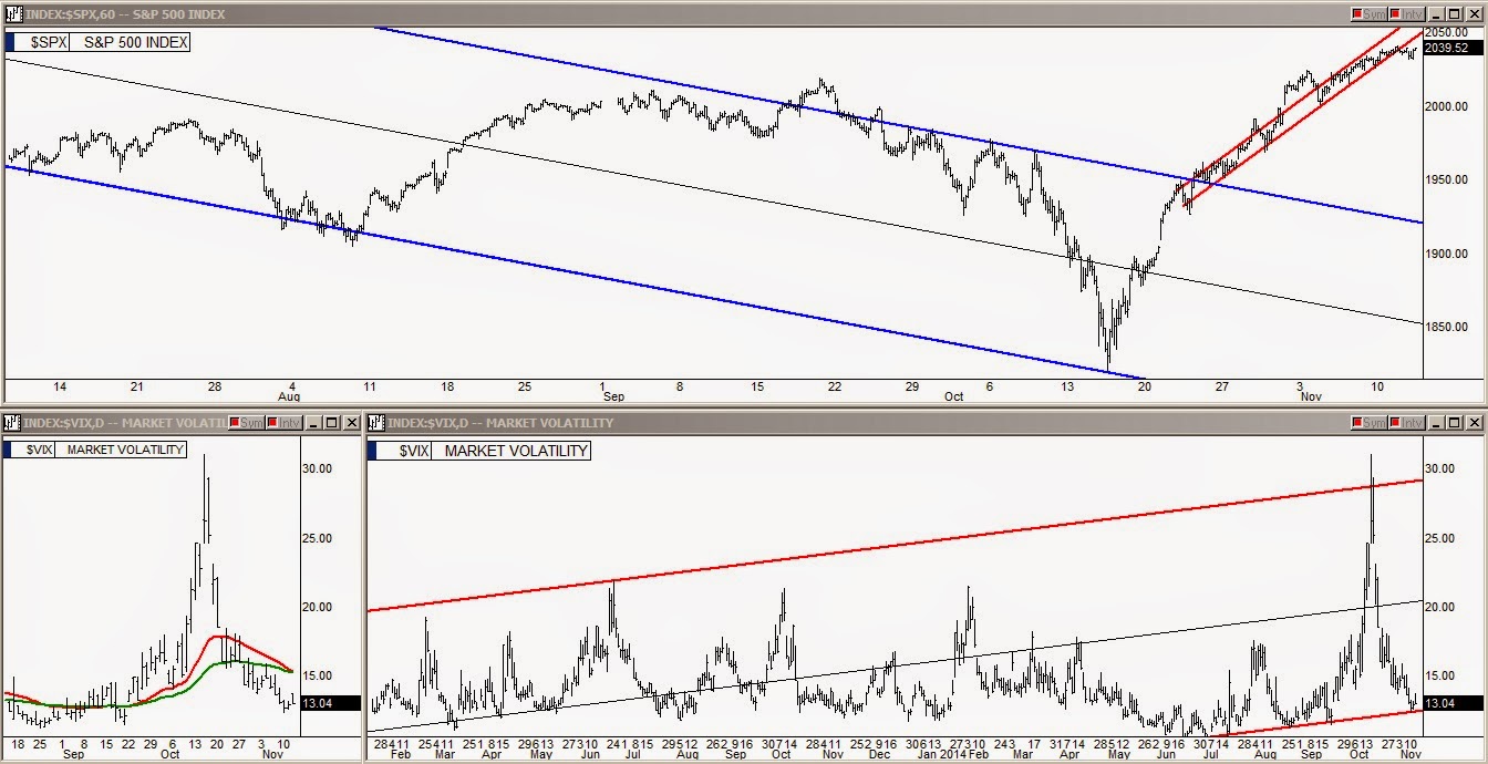
The Santa rally that had a last minute start has shown to be a success even more so than many might have thought.  It's time to take a look to see how high the S&P and the Nasdaq have climbed over the past week and a half.


click on image to enlarge


The S&P chart shown above has a reading of 202 points above its 324 EMA line at Friday's close.  Anytime the S&P gets above the +200 level it is living on borrowed time.  While Friday's 202 is still one typical up day from its 219 point average extension of the past twenty-four months, it is already at the peak over-extension trend line shown in red.  Considering both the red over-extension line and the current numerical distance from the green 324 line enables us to get the best read on when the current market run is done.  The S&P may be able to get a little higher in the next few days but we are very close to a maximum over-extension.  


click on image to enlarge


Looking now at the NASDAQ chart shown just above, the most noticeable difference is that in the past eight months the maximum over-extension of the NASDAQ has been reduced considerably from the over-extensions of last January and March.  The market is only allowing approximately 600 points of extension in the past eight months, reduced from the approximately 700 points from last January and March.  Friday's close on the NASDAQ was +595 which is also very close to its max and the NASDAQ is also above its red over-extension line which is the frothiness that the NASDAQ develops sometimes before it starts a decline.  

While the Santa rally could float us up a few more points on both indices over the next several days, having both so close to their  maximum extension is definitely a heads up at least for those who go in and out of the market every couple of months or so.


Trade well my friends

Alan

Tuesday, December 23, 2014

Examining the 35-Year S&P Chart

As traders and investors begin thinking about the new year and what may come, it's critical to thoroughly examine where the S&P is at now and in previous multi-year runs.  


click on image to enlarge


In the chart above showing thirty-five years of trading in the S&P using yearly candles, I have recorded how overextended the 1999 internet bubble got above its twenty-year EMA line and fifty-year EMA line.  I have also recorded where the S&P is at now relative to its twenty-year and fifty-year EMA line.  It's not difficult to see that we are at the long term over-extension again.  The small chart to left above shows the same thirty-five year view.  


click on image to enlarge


In the monthly bars chart above,  the S&P shows that it has maxed out in both its six-year bull run channel shown with red lines and its twenty-year incline channel shown with blue lines.

For the time being the Fed's all powerful buying algorithm is keeping the market up and continuing to inch out new highs.  How long they can continue to do so is what everyone wishes they knew.  

Trade well my friends

Alan


Thursday, December 18, 2014

Yellen On A Roll

Fed chief, Janet Yellen, continues to prove she can turn a falling market back up as well as any of her predecessors.  Through her mastery of linguistic acrobatics she gave the market a pass on Wednesday and then followed through with gifts for all on Thursday with a 48 point rally in the S&P .  We now know just how powerful their new stock buying algorithm really is. 

When they were testing it on Monday it nearly broke the VIX meter, causing it to jump in 4 point spikes every few minutes all afternoon.  From the time they turned it on Wednesday, the market has rocketed up more in two days than it did in four days from the October "v" bottom and that October short squeeze has been declared the mother of all short squeezes by bulls and bears alike.  Which creates a conundrum, what are we going to call this short squeeze?

Yellen may need to tone down their new algorithm just a bit though.  As the market approached the final minute of trading Thursday the algorithm was pushing the SPY a little too hard and in the last minute of trading it drove the SPY up $6 all the way up to 213 / 2130 on S&P before reversing back down to the 207 area before the market closed.

There were 1,147 trades during that minute for a total of 610k shares, roughly $200 million.  This was not a "bad tick".  The exchanges have issued a ruling that the trades will stand.  All traders chasing the short squeeze with market orders that were filled up at 213 were burned as they lost $6 on the SPY in seconds.  In the Daily chart below, you can see how high the algorithm drove the SPY before they could get it under control.  


Click on image to enlarge


Trade well my friends

Alan

Tuesday, December 16, 2014

S&P: Analyzing Multiple Views


Tuesday's market action was yet another extreme roller coaster ride that ended with the S&P substantially in the red.  On Wednesday, Yellen's Fed statement will be released and there has been discussion that this will be the most important Fed statement to date.  To really understand how critical it is for Yellen's speech to please the market we need to take a look at multiple views of where the S&P is at now.  


Taking a look at the 6-month chart above of two-hour bars, we see that the S&P closed right at the lower line of its short term channel.  It would be reasonable to expect that failing that line again would have the same consequences as when it failed in early October.  We got just as overextended with this last run up and now the market has geopolitical pressures and plunging oil that weren't there to any degree when we failed the line in October.  


The weekly bar chart of the S&P chart above shows the three-year midterm channel with blue lines and the two-year midterm channel with green lines.  Tuesday's close has the S&P barely hanging on to the lower line of the green channel whereby just a 1 point move lower will put it back into the blue channel which is still a very bullish channel.  The danger of resuming trading in the blue channel is that there is about 165 points down to the lower line and a visit to the lower line would be normal if the S&P uses that channel to continue higher next year.    


In the next chart above, we see the entire 6-year bull run shown with the red channel and also the 20-year incline channel shown with the black lines.  Last month the S&P reached the upper line of both the 6-year bull run channel and 20-year incline channels.  


The last chart above is actually the previous chart but zoomed out considerably to really see the big picture.  This chart shows the entire 20-year incline channel.

Considering where the S&P is at right now on all of these charts, Yellen's statement tomorrow could truly be a historical marker.  If she keeps the "considerable time" phrase the market might react favorably and turn bullish for a while as it is fairly oversold short term and has a lot of trend lines to push up from.  If the phrase is removed and is not replaced with a new favorable perspective on current economic conditions, the market could easily slip through all the trend lines in the top two charts above and a sustained fall could develop quickly.  As usual the two hours after the monthly Fed speech are ruled by the the Fed's FOMC day algorithm buying program and we normally don't see the true reaction until the next day's trading.  


Trade well my friends

Alan

Monday, December 15, 2014

VIX: 4-Hour Bare Knuckle Street Brawl

In the market Monday we saw a unique event take place.  From the opening bell the market started falling and by 11 AM C.S.T. the S&P had sliced through all the key support levels that it had closed at Friday afternoon.  The market was moments from a freefall when the Fed turned on what is obviously a brand new algorithm buying program that made the intraday VIX (volatility index) meter shake in four-point spikes every few minutes the rest of the day.  Big sell orders continued coming through causing the VIX to spike repeatedly but the Fed's program bought the sell orders relentlessly pulling the VIX back down as fast as it went up.  This happened continuously through the rest of the day as can be seen in the chart below.

click on image to enlarge


The fierce battle stopped at the bell with the S&P downtrending into the bell.  This "line drawn in the sand" battle is easy to see but the question is, who won?  With the S&P drifting down into the bell, you might think that the sellers won but just as soon as the market closed they came in and bought the SPY back up fifty-cents quickly.  The S&P futures are well into the green in the early evening hours Monday night.  It's ridiculous that such a conflict took place with an unclear winner but that is where we are at.  

To throw a wild card into the situation Yellen's speech is Tuesday and Wednesday and she always turns the buying program on during her speech days to prep the market with the desired reaction to the Fed speech.  With the speech coming, the next move in the market may be muddled by the two-day event where little trading takes place and then normal trading resumes Thursday.  This is a very frustrating situation for investors who are trying to figure out if they will pump the market one more time before year end to give the traditional Santa rally at least to some degree or if there will be more selling to come soon.

The charts below show the key levels that the S&P fell through on Monday.  I discussed the situation in each of these charts in detail in my article this morning on Investing.com under Opinions / Analysis / Stock Markets.


                                                        click on images to enlarge


Trade well my friends,

Alan

Sunday, December 14, 2014

The Big Picture: 20 Year Index Charts

The following are the 20 year charts of the key Indices.  Long term channels and current midterm channels are both shown on each chart.

click on images to enlarge


Friday, December 12, 2014

S&P & VIX End Week At Key Levels

It's probably time to stand back and take a look at where the S&P and VIX are at now after the market's first bad week it has had since the early October plunge.  Both the S&P and the VIX closed out the week at key levels in the moving averages and trend lines.  


click on image to enlarge


Looking at the chart above, the S&P closed right at its 50 day simple moving average line.  The 2002 closing number is also the center line of the midterm channel (shown with fine green line) and also, 2002 is essentially the big round 2000 level benchmark.  Dropping through any of these three on Monday could bring in another wave of selling.  One would think, however, that there would be support for at least a couple of days of sideways trading here but it's a risk to bet either way just yet.  


click on image to enlarge


In chart 2 above, the two year Fed bubble channel is shown and today's 2002 S&P closing is right at the lower line of this channel.  If we breach that line Monday, once again another wave of selling could be triggered because of this chart.  As in the daily chart it would be reasonable to think that there would be at least temporary support here but we will just have to see.  


click on image to enlarge


The above chart is of the VIX (Volatility Index) showing that the VIX closed at the key 21 level which is the center line of the long term slightly downhill channel (shown in black) and also the center line of the newly forming uphill red line channel.  The S&P did pop across both center lines in the last hour Friday but returned back to the center lines for the close.  That little blip was actually triggered off of intraday technicals on the VXX (VIX Short Term Futures ETF).  I don't think too much meaning should be read into it as far as if it might be looked at a hard test of the center line, it looks like closing right at the lines is a truly neutral pivot with a move Monday either way being capable of swaying the crowd.  


click on image to enlarge


Finally, taking a look at chart 4, the S&P over-extension chart, we see that it put in a double top at the maximum extension level.  Normally, they prop the market up in a sideways trend for a minimum of four weeks after first reaching the maximum extension level and then the fall begins.  This time it was different, however, because it has only been propped against the maximum extension level for barely two weeks before the fall began which can be attributed to the bearish catalyst of plunging oil prices and its implications of  a slowing global economy. 


Trade well  my friends

Alan

Tuesday, December 9, 2014

Once Again...

Stock Market Technical Analysis


click on image to enlarge


Over the past several years, every time the S&P has reached maximum extension from its 324 EMA line there has been a 75 to 200 point pull back happen within 4 to 8 weeks of reaching the maximum extension.  During that 4 to 8 weeks of propping the market at the maximum extension level bonds always make a nice run and the S&P scratches out only a few more points.  This has happened over and over.  All an investor has to do is to sell out of stocks when the S&P first reaches the maximum extension level, switch over to bonds and make money on bonds during this propping period and then the fall.  Once the market gets oversold and a decent signal sets up, switch back over to stocks for the ride back up to maximum over extension.  

How many investors do it?  Maybe one out of a thousand switch from stocks to bonds at the arrival of S&P maxiumum extension.  


Trade well my friends

Alan

Wednesday, December 3, 2014

Fed Withdraws Liquidity

Stock Market Technical Analysis


click on image to enlarge


Taking a look today at what our good friends at the Fed have been doing.  The chart above shows the weekly reported numbers of the Fed's balance sheet.  The new balances are above each weekly bar with the net change from the previous week below each bar.  The notable items are the September 17th 28 billion injection to try to stop the sell off that had already begun.  They stepped in again with a 19 billion injection on October 15th to start the global short squeeze that ensued.  Over the following five weeks they continued to inject liquidity long past the official end of QE.

Things changed last Wednesday, however, when they removed liquidity for the first time since October 1st, right before the market took the big dive.  This past Monday's opening drop was a reaction to the Fed actually removing liquidity.  After Monday's drop, it looks like they couldn't accept that kind of reaction and turned on the all powerful tractor program on the SPY which has kept running right up through Wednesday's close and is shown in the chart below.


click on image to enlarge


This tractor program tightly controlling trading the past two days has pulled the S&P back up above the week 5 EMA line which it dropped down through on Monday as shown in the top chart with the red line.  This tractor program has also pulled the S&P back up close to its maximum extension again as shown in the chart below.


click on image to enlarge


Looking at this over-extension chart we see that Wednesday's close is 212 points above the 324 day EMA line with the average over-extension being +219 points over the past two years.  If they keep the tractor program running they could grind the S&P another 10-15 points higher until the tether line is stretched absolutely as far as it can be from the 324 line.

This situation of having the market this over extended but not quite to its absolute max has produced a low volume environment where no one wants to buy but no one wants to short either.  


Trade well my friends

Alan

Saturday, November 29, 2014

VIX Triggered at Midday Friday

Stock Market Technical Analysis


click on image to enlarge


Taking a look at the S&P over-extension chart shown above, we see that the S&P has been going sideways at its upper red trend line for the past several trading days. Friday morning's opening showed the S&P at 214 points above its 324 day EMA line, the midterm neutrality line for stocks & indexes.  Looking back over the past two years I have marked in the peak over-extensions and how many points each was over-extended from its 324 EMA line.  The average over-extension peak is +219 points.  Technically we stopped five S&P points below the average over-extension peak, but the fact that the S&P has not been able to break through the resistance of the upper red trend line shown above lends to the argument that the peak might be here.  

Everyone knows that the trading action over the past week has been nothing more than keeping the S&P as high as possible to entice consumers to be a little looser with their purse strings during black Friday shopping.  However, there has been considerable conversation on the internet the past 24 hours as to what happened shortly after lunch on black Friday when the indexes and key stocks took a sharp dive.  This sudden drop was triggered by the up crossing of a channel line in the VIX chart below.


                                                            click on image to enlarge


Taking a look at the VIX chart above, focusing on the last trading bar, we see that the VIX opened still below the lower lines of both the black line long term channel and the red line midterm channel. By late morning Friday, the VIX crossed up back into the black line channel and and then at midday it crossed back up into the red line channel which caused the sudden drop in just about everything.  

The Fed's task of getting the market as high as possible for the black Friday shopping weekend was obviously a success.  Now that the job is done and the bulk of the consumer's retail spending has been done (consumer spending is 70% of the economy), everyone will be watching to see if the VIX's return back into its uphill red channel is an indicator that we just saw the traditional Santa rally and that December trading will be nothing more than chart noise or a decline.

We will see...


Trade well my friends

Alan

Monday, November 24, 2014

Fed Still Pumping Up Stock Market

Stock Market Technical Analysis


click on image to enlarge

There has been misinformation coming out of the franchise news sites over the past few weeks that the reason the stock market reversed back upward after the farewell to QE speech six weeks ago and has been climbing to ever increasing heights since, has been greatly attributed to investors believing that QE wasn't necessary and that the market can climb with out it now having gone up 200+ S&P points in six weeks.  This all sounds good but the facts of public record show a different picture.

The chart above shows the size of the Fed's balance sheet in trillions of dollars with its once a week numbers posted above corresponding weekly bars of the S&P 500.  

  • 9/10 - the S&P starts showing signs of faltering, looking like it was about to roll over
  • 9/17 - the Fed injects 28 billion to see if it can stop the sell off from beginning
  • 9/24 to 10/13 - S&P suffers a staggering sell down
  • 10/15 - the Fed injects another massive sum of 19 billion to start a global short squeeze
  • 10/15 to 11/19 - Fed's bond buying / liquidity injections continue as normal even though  it has been officially turned off with the Fed's balance sheet increasing a massive 37 billion in the past six weeks

As long as the Fed continues injecting liquidity into the market, the S&P will likely continue to become even more overextended.  When will the market run end?  Very likely, the first week the liquidity injections show a zero for the week or an actual reduction in the Fed's balance sheet for the week.


Trade well my friends

Alan

Wednesday, November 19, 2014

Weekly Index Charts Holding In Overbought Condition

Stock Market Technical Analysis


click on image to enlarge

Taking a look at the weekly charts of the S&P and the NASDAQ, we see that both indexes are still holding at their maximum distance from their weekly 65 EMA lines shown in blue in the upper part of the two  charts.  Also, both indexes are still holding at the upper line of their expanding triangle patterns, an unnatural place to just hold when extended so far from the weekly 65 EMA line. 

Looking at the middle section of the two charts, we see that the S&P and the NASDAQ both just pegged the weekly 100 stochastic level after making a zero to one-hundred stochastic run in record time.  

Looking at the bottom section of the charts above, we see that the bearish RSI divergence that took the market down a couple of months ago is set up once again for doing the same.  

Normally, this is a textbook sell off situation ready to start but two things have to be considered:
  1. Friday is options expiration and Puts have been outselling Calls three to one.  We should have been seeing a quick move up in the market Wednesday and continuing into Thursday so that they can wipe out the Put holders but it's not happening.  It's unusual that we are not seeing this, pumping the market higher right before expiration has been free money for the option divisions of the big Wall Street firms the past two months.  
  2. The Fed is no doubt not at all pleased with how these charts look and how paired institutional marker trades continue to come through on the SPY.  If you are a bear you might not want to be the first to go short because up until now, standing in front of the Fed's stealth buying programs has not been a very healthy thing to do.
We will see...


Trade well my friends

Alan

Monday, November 17, 2014

Big Market Move Imminent?

Stock Market Technical Analysis


click on image to enlarge

In the market Monday we had another day of the horizontal tractor program that has been running the past week and a half on the SPY.  This is actually the second tractor program since the Advance Decline divergence began three weeks ago which I focused on in my previous article.  Chart 2 above has the two tractor programs marked in blue lines and shows the EMA pair whose up cross marked the beginning of the rally and shows that they still have not down crossed on the S&P.  However, in chart 3 we see that the NADSAQ had the same EMAs down cross midday Monday and chart 4 shows the Russell 2000 down crossed last Thursday afternoon.  It would have been another meaningless sit and wait day for the S&P except that there were very important trades after the close today.  

Looking at the top left corner of the cluster above, I have a time and sales log for the SPY showing after hours activity.  After the close, there were multiple institutional marker trades that the big Wall Street institutions send out when they have decided it's time for the market to start a new and pronounced move.  Team Yellen has been running the show with the two tractor programs for the past three weeks but Wall Street is signalling that it is time for that to end.  The trades were a pair of 1.10 mil block trades followed by a pair of 4.50 mil block trades.  Several times throughout the years I have brought attention to these same 4.50 mil and 1.10 mil marker trades when they have come through after hours.  The Wall Street institutions that send these trades through always have them paired and in these same amounts each time.  The reason being is to communicate clearly to the professional and institutional investment communities to be prepared for a big move in the market to begin soon.  We finally got both pairs this afternoon and if we look to the Bollinger Bands chart of the SPY with two hour bars just to the right of the log above, we can see that the Bollinger Bands have constricted about as tight as they ever get which happens right before a major break in one direction or the other happens.

The Advance Decline divergence chart in my previous article says the market is about to plummet like a rock, however, Team Yellen's tractor programs have somehow morphed from a rather sloppy narrow trading channel before the end of QE announcement to an incredibly powerful program that keeps the market locked tight in a very narrow channel regardless of any large sell orders coming through when the SPY is at the lower line of this tractor channel.  Only one of these two major market forces will have their way if the two are not in sync.  It is worthwhile mentioning that these same pairs of 4.50 mil and 1.10 mil marker trades came through the day before the 200 plus point S&P short squeeze started in mid October.  Logic now says that these marker trades are Wall Street's signal that the market is about to turn down.  However, there is that word, logic.  If you have been using logic for your trading in the past month then you probably had your head handed to you in a basket.  For those who are not aware, all after hour trades are masked as to whether they are a buy or a sell so you have to figure out whether the marker trades are signalling if the market is about to sell off or start another rally.  Yellen's PPT no doubt also saw the marker trades come through and I'm sure they realize that if they are going to start a short squeeze to make the market do what is widely viewed as impossible at this point in the cycle, their window to do so just became very small.  The questions now are these marker trades exits or entries and is the market going to break upwards or downwards?  

Either way, get ready because Wall Street has officially signaled that they are about to break the market out of these tractor programs with a pronounced move in the market very soon.  


Trade well my friends

Alan

Friday, November 14, 2014

Major Advance - Decline Divergence

Stock Market Technical Analysis


click on image to enlarge

There has been a lot of discussion as to what happens when the global short squeeze winds down to an end.  Many are wondering if this move is real or even sustainable.  The key to analyzing this question is to look at the market breadth of this huge move.  The Advance Decline Index is the easiest and most accurate way to see what is really going on behind a move.  The purpose of the index is to confirm that a move is real and sustainable by checking to see if the Advance Decline climbs as the rally climbs.  If the Advance Decline makes higher highs as the stock market makes higher highs then it is a confirmation that the rally is both real and sustainable.  If, however, the Advance Decline trends down as the market climbs  it indicates market manipulation as the Indexes are being dragged higher by a small handful of mega stocks and ETFs while the vast number of stocks are selling leaving fewer and fewer actually participating in the market move. 

Taking a look at the two charts above, the top chart is of the VTI (Vanguard's total market index ETF) which is a good representation of the entire stock market and is a very good match for comparing to the US stocks Advance Decline Index (shown in the lower chart).  We can see that the stock market has been climbing higher for the past three weeks while the Advance Decline has been down trending fast.  A textbook non-confirmation of the rally.  Historically, when this happens this is the ultimate buyer beware because a hard drop in the market may be imminent.  

Will the market drop happen?  In light of the all powerful tractor program that has been locked down on the market for the past week and a half and the manipulation that has gone on in the SPY and QQQ shamelessly, I would not go short just yet as they continue to show that they have no problem bulldozing reason, logic, and technical analysis to achieve their desired results in the stock market.


Trade well my friends

Alan

Thursday, November 13, 2014

Wednesday, November 12, 2014

VIX Finds Support at Lower Channel Line

Stock Market Technical Analysis


click on image to enlarge

In the market Wednesday the S&P took its first small dip giving the VIX a pop up from its lower channel line that it reversed up from on Monday.  Monday's VIX reversal led to the S&P dropping out of its three-week uphill channel Tuesday morning.  Since then the S&P has been sideways as they are very determined to keep it from dropping which almost all traders are expecting it to happen very soon because the VIX has a big EMA pair set up ready to lift which is shown in the lower left corner chart above.  This same EMA lift setup is what triggered the sell off to begin in late September.  

The lower channel line of the VIX is very well defined and technically the market should be beginning to roll over now.  However, they are fiercely determined to keep the market going sideways hoping that if it continues sideways long enough it might cause the VIX to drop on down through its lower channel line which would really change the dynamics of where we are at in this cycle.  Their efforts being applied against a very heavy market is why the market has become so stale and boring.  They know that if they don't break the VIX down through that lower channel line that the S&P could easily roll over and drop 210 points just as fast as it squeezed 210 points up from the sharp "v" bottom.


Trade well my friends

Alan

...and the Battle Begins

Stock Market Technical Analysis 


click on image to enlarge


Trade well my friends

Alan

Tuesday, November 11, 2014

Sunday, November 9, 2014

Another 27 Points Left In S&P Run?


In the market Friday the S&P had a third day of slow creep up where it closed above the multiple resistance lines I have focused on in my recent articles.  Now that the S&P is technically above resistance everyone is wondering just how much higher it can go in an overbought condition.  

Taking a look at the two small charts below, I have posted an overview of the current run.  

Chart 1: the S&P chart I posted in my October 21st article showing the large EMA setup they constructed to provide the lift power for a sustained short squeeze.

Chart 2:  shows the run up with our swing trade EMAs applied.  Our entry was at the up cross marked with the small green dash.  Our exit will be whenever it down crosses.  While there have been several close calls at multiple resistance points we are still in the trade even though it is getting overextended because until it down crosses the trade is still on.


If the S&P continues to inch higher we plan on going ahead and selling in the 2058 area for the reasons I will outline in the chart below.  Taking a look at the large chart below, I have marked in the overextended peaks for the past two years.  The heavy green line is the Day 324 EMA which I have discussed numerous times through the years on my blog showing how this line is considered midterm neutrality for stocks and indexes.  An "overextended condition" can be measured numerically by how many points the S&P is currently above the 324 EMA line. In peaks A through E I have noted the number of points the S&P reached up from its 324 EMA line before the rubber band became stretched all it could go and the market decline began.  If you study the chart you can see that once the S&P gets 200 points above the 324 EMA line it is basically living on borrowed time with the 217 to 227 range being the peaking area.  At Point F, I marked in the next potential peak at S&P 2058 which would be a 215 point extension.  Looking back we see that it often moves another 10 points higher than the line before the peaking day which would be in the +225 area possibly another week or so out if the creep up move continues.  We are actually targeting the red line this time around 2058 as the market's steadiness when not in a short squeeze has diminished somewhat since the October plunge.  Friday's close is 187 points above the 324 line.  In the bottom corner of the chart I posted the simple math showing the 2058 red line target less Friday's close which was 2031 leaving a net of 27 points left to the upper red line.  

Another 27 points anyone?


Trade well my friends

Alan

Friday, November 7, 2014

Blog Archive