Before I post tonight's usual charts and analysis I would like to post a really good article about one of the more stealthy methods the FED has been using to pump the markets up artificially this year:
-------------------------------------------------------------------------------------------------------
"The Only Reason Stocks Have Rallied This Month" by Graham Summers
The Fed generally claims that it stopped its first Quantitative Easing (QE) program back in March 2010 and that there were no additional debt monetizations between then and the announcement of its QE lite program in August.
Yet, as I’ve proven time and again, the Fed has continued to monetize Wall Street’s debts EVERY options expiration week since QE 1 ended… proving beyond a doubt that the Fed’s QE program did NOT actually end in March.
Here’s the chart of the Fed’s recent actions for those of you who haven’t seen this before. Options expiration weeks are in bold.
Week
Fed Action
July 22 -$8 billion
July 15 +$8.6 billion
July 8 2010 +$1 billion
July 1 2010 -$13 billion
June 24 2010 +$175 million
June 17 2010 +$12 billion
June 10 2010 -$4 billion
June 3 2010 +$2 billion
May 27 2010 -$16 billion
May 20 2010 +$14 billion
May 13 2010 +$10 billion
May 6 2010 -$4 billion
April 29 2010 -$1 billion
April 15 2010 +$31 billion
April 8 2010 +$420 million
April 1 2010 -$6 billion
You’ll note that the Fed ALWAYS made its largest capital contributions during options expiration weeks. Heck it pumped $31 BILLION into the system in April 2010, just ONE MONTH after it claimed QE 1 ended!
However, since that time the Fed has pumped a total of over $65 billion into Wall Street on options expiration weeks. On non-expiration weeks the Fed either withdraws money or makes small money pumps.
This pattern finally ended in August 2010 when the Fed failed to pump the system on options expiration week. But then again, why bother? The Fed was about to announce its QE lite program in which it would use the interest on maturing securities to purchase Treasuries from Wall Street Primary Dealers via its Permanent Open Market Operations (POMO).
I realize that last sentence is a lot to take in. So let me explain how this new QE Lite Program works before we continue.
During Treasury auctions there are 18 banks, called Primary Dealers, who are given unprecedented access to US Debt (Treasuries) in terms of pricing and control. These are the BIG BOYS of finance including firms like Goldman Sachs (GS), JP Morgan (JPM), Bank of America (BAC), Credit Suisse (CS), and others.
During its QE 1 Program, the Fed bought over $1.0 trillion in securities from these firms. Its new QE lite program consists of it using the interest and proceeds from the securities in its portfolio that are maturing to buy Treasuries from the Primary Dealers via Permanent Open Market Operations (POMO).
In simple terms, the POMO actions allow the Fed to pump money into Wall Street (by buying Treasuries from the Primary Dealers) without DIRECTLY monetizing Treasury debt (the Treasuries had already been issued). The Primary Dealers then take this fresh capital from the Fed and plow into stocks, forcing the sort of ramp job we saw last week on Friday.
All told, the Fed has bought $20 billion worth of Treasuries in this fashion, $11.15 of which it purchased last week alone. With this kind of weekly money pumping in place, Bernanke and pals don’t need to continue their “behind the scenes” games (like the options expiration week money pumps).
Or do they?
Unbeknownst to most investors, last week Ben Bernanke pumped an additional $11.05 BILLION into the system ON TOP of the $11.15 pumped via the POMOs. In plain terms, the Fed juiced the system by $20+ billion in a single week, bringing its liquidity pumps RIGHT BACK QE 1 LEVELS.
If you want to know why stocks have rallied in the last month, this is THE reason. The economy isn’t improving and the European Crisis isn’t over. Nothing has improved. All that has happened is the Fed funneled money into the Primary Dealers who ramped the market.
This is also the reason why the latest rally has almost entirely consisted of gap ups: the Primary Dealers ramp the market and then the computer trading programs take care of the rest.
In plain terms, the market is being juiced higher, plain and simple. There is no fundamental reason for stocks to be rallying. Moreover, we have numerous signs of a top forming (mutual fund cash levels, insider selling to buying ratios, negative divergence, etc). Those who choose to buy into the farce of a rally are going to get what’s coming to them. And when they do, it won’t be pretty.
(end of article, my post for tonight follows below)
-----------------------------------------------------------------------------------------------------
Tensions rising ...
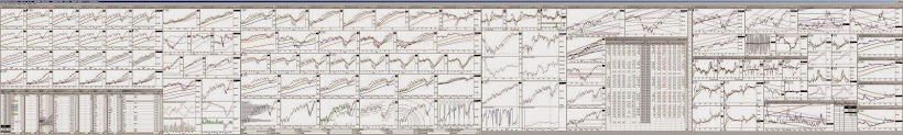
Click on above images to enlarge
Today the stock market received a second prop visible in the lower chart cluster, row 1 chart 4. We now have two props holding us up from the lower line of the brown mother channel. The reason for these props is visible in the chart directly below that one ( row 2 chart 3 ) , where we see that the S&P has now tried and failed four times to get back up into the red line bull channel from early summer. This struggle is causing the VIX/fear index to build a setup for moving higher. To help follow the key relationship between the VIX and the S&P I am adding a second pair of charts into the lower cluster, row 2 position 1. These are daily bar charts with 5/10 moving averages to give us a different perspective on the inverse relationship between the S&P and the VIX. (we have been following the VIX and S&P on 2 hour bar charts with channels drawn in the upper chart cluster,row 1 and row 2. ) These 2 new charts are of the VIX and are stacked on top of each other directly below the S&P chart which is it's market inverse. What we see happen in the S&P chart (with green side bar print) should be the mirror opposite of what happens in the 2 VIX charts below it which have their side bar print in red.
Which leads me to tonights big issue - the S&P put/call for today is a incredibly bearish 3.53 which means the vast majority of options players see that the past 3 days market action has been grossly manipulated upward and may be about to fall back in everyone's face. This manipulation can actually be seen in the lower chart cluster, row 1 chart 1 (S&P) when compared to row 2 chart 1( the 5/10 ma chart of the VIX ). If you study the red 5ma line and the green 10 ma line in one and then the another you will see that in the VIX the red 5 crossed above the green 10 line last week and the S&P should have done exactly the opposite - its red 5 line should have crossed down through it's green 10 line to match perfectly but inversely. But Friday the bailout team intervened big time and the S&P 5 line bounced up from its 10 line instead instead of piercing down thru the green 10 to match inversely with the Vix. A classic bearish divergence. Now, as the VIX 5 line has been starting to be pushed upward by its 10 line, the S&P is supposed to have its 5 line up underneath its 10 line and it should have started to push downward by its 10 line over the past couple days - like the VIX but upside down. As you can see though their market jamfest last Friday altered these lines so that the S&P 5 line is still above its green 10 line.
This divergence is revealing that the past 3 days is not real trading and artificial moves typically reverse in an ugly fashion. The S&P put/call shooting up to a nightmarish 3.54 is reflecting the widespread anticipation that this forced market action is about to fail.
The Vix is a complicated tracking device for measuring fear in the market. This is an indicator that does not lie and cannot be manipulated by design. When the S&P is not the mirror inverse of the VIX, the S&P is being manipulated to keep the market from pulling back when it really should be and seasoned traders and investors know to keep their hand close to the sell button. It is going to be interesting
Alan