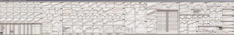
click on above images to enlarge
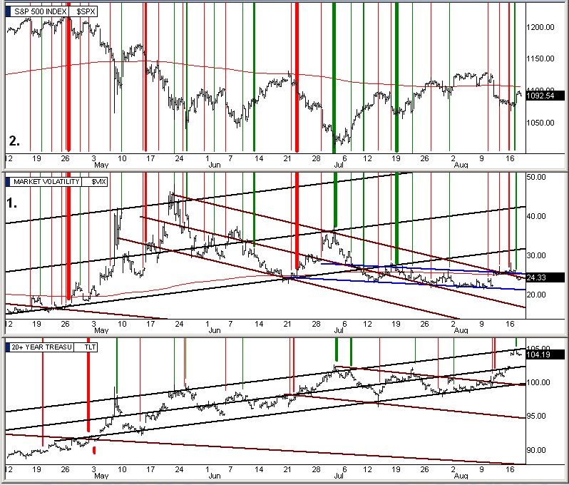
From a post earlier today, the bailout team stepped in this morning and made it very clear they were there by sending in continuous 1million+ share block buys ridiculously above the current ask. I have my time and sales log programmed for when these come thru they are highlighted in neon green and let's just say it was a colorful morning. You can see on the vix chart at the top, the double vix / S&P chart, that today's trading - the last four bars - was basically sideways action outside the opening blip as was the same for the vix. Nonetheless, the vix closed outside the blue channel again which makes it farther out of the brown downhill vix bull channel.
You will also notice that I added the day chart 108 EMA into this more focused chart as a red line. You can see how the vix/fear also uses the 108 line as a neutrality point. Now we are on top of it.
On the lower group of charts, chart 1 row 1, we can see how they are trying to rescue the market by having the red 5 EMA line catch the pink 50 EMA line so that the red will trade sideways on top of the pink 50 before curving up for the start of a new rally. This is a pivotal point, if in tomorrow's trading the market goes down, it could cause the red 5 to pierce down thru the 50 pink and that could trigger 2-3weeks of ugly selling. If the market is sideways or slightly up the red 5 EMA will turn sideways and lay flat on the pink 50 positioning itself for a nice retest rally to begin in the days to follow that. Tomorrow is critical for a successful rescue. If they do manage to start a 5/ 50 bounce it will put the vix / fear back down into the brown downhill channel that allows the market to rally. If on the other hand it pierces thru the 50, the vix will very quickly jump up into the black uphill bearish channel for a prolonged sell off. Also notice that the volume is declining, another bearish indicator that people are just not buying the rescue that they are trying to pull off.
In chart 2 row 1, we are underneath the heavy rose colored line - the 324 EMA - which is a really long term neutrality line similar to how the 108 is a midterm neutrality line. Today's candle was a reversal candle which tells us tomorrow they are going to try to make the move. In chart 3 row1, I posted a large 9 month chart of the SPY / S&P500 and in it we see how we dropped thru the 108 line as soon as we broke thru the uphill blue trendline. As you can see, they are catching us where they absolutely must do so - the lower line of the new uphill brown line mother channel. They will try to hold that line with everything they have tomorrow. If they somehow cannot hold it, the market rescue will have failed and the next support is not until the July 1st lows that you can see in the chart.
In chart 1 row 2, my data feed service is having problems with the graphical representation of on balance volume tonight. I rotated into alternate server farms but still the same so we will have to ignore this tonight as the blue line is not working correctly. In chart 2 row 2, you can see the various support levels below us but we don't have any moving averages support below us, we are below all of them now. That is why it was so crititcal that they begin the rescue today as I discussed Friday night. Granted they are working it now but they are having trouble making progress. This can be seen by comparing chart 3 of row 2 against the advance/decline chart directly below it. You can see how in the S&P chart, Thu - Fri - and today's trading has been slowly drifting downward while at the same time the advance/decline has been climbing up from the depths of the buy area and is approaching the moderate sell area already. If we get up a little higher into the sell area tomorrow and people see that all that happened during the 4 day advance/decline ascension was that the S&P drifted lower during the 4 days when it should have gone up proportionately everyone will realize that the 4 day upward push in the market netted a loss for 4 days and that when the advance/decline heads back down again, the down draft could be a tremendous force.
This is a classic adv/dec bearish divergence that normally would be ominous of a serious market sell off over the next few days. However, the bailout team is working to turn the market around before a multi month down leg gains steam and tomorrow is their D-Day. If tomorrow's close doesn't show promise, Wednesday morning might be a dangerous open unless they serve up a monster gap open out of the blue, which will only be a gap and trap as shorts will pile on a big gap up in force.
It's encouraging that they are trying to save the new mother channel that is shown with the heavy brown lines in chart 1 row 3. If they lose that, the path of least resistance will be very heavily weighted to the downside for some time.
One other factor, options expiration is Friday. When the third Monday in every month comes around, the big wall street firms spend the next four days focused on one thing, making as many options as possible expire worthless on Friday expiration day. If on Monday the total S&P Put/Call ratio is below 1.00, it means that more people have placed option bets on the market going higher than the market going lower so the gameplan for this type of week is to push the market down as we approach Friday so that it will wipe out the Call side option imbalance. If on the other hand the Put / Call ratio is above 1.00, which means a Put side imbalance or more people betting the market will go down, then they will want to drive the market up by Friday expiration to wipe out the Puts that have been bought. This is an ongoing game that is played the third week of every month. Whatever the market is doing during the first, second, and fourth week of the month is absolutely irrelevant to what happens in the market during options expiration week, which is this week.
Tonight the total S&P Put/Call ratio is 1.55, this is very heavily weighted to the Put side which means the majority is betting that the market will continue to fall. If the market does continue to fall thru Friday wall street will have to pay out on all these Puts and it will be a hefty price. So the gameplan will be for them to get the market as high as possible by Friday to wipeout this Put side imbalance. For them to do so would be a major cash windfall for all wall street firms. When the options week imbalance is minor to one side or the other sometimes they won't bother with pushing the market the opposite direction.
This desire by wall street to drive the market higher by Friday (even if they end up letting it drop like a rock next week) will be a real boost to the bailout team at this point in the charts. On the other side of the coin the bond market is receiving cash from people bailing out of the stock market that is truly remarkable. The public is nervous about the economy and stock market both. Since the bond market is seen as the safe place to park money thru unsure times there is a downward pull on the stock market from people rotating into the bond market. This is another reason for the low volume we have right now. Whether or not the bailout team and wall street's options expiration week game plan are enough to offset the flight to the bond market remains to be seen. We will see a lot this week one way or the other.
Alan
P.S. I will post the individual 20yr "is your stock overextended?" charts on the weekends instead of nightly, and post a good number of them at a time. Also one of my untriggered buy orders, FBR, triggered today and is in open trades now.